
Integrative Conservation Clinic - Built for care providers—an intuitive mobile platform that captures, transcribes, and analyzes sessions.
The Integrative Conservation Clinic (ICC) at William & Mary University struggled to translate their research into an accessible online platform for conservation professionals due to a lack of technical expertise. By collaborating with our team, we developed a framework with features like tiered content organization, multilingual accessibility, and annotation functions, effectively enhancing information access and user experience to support their conservation efforts.
Project Type
End-to-End web application
Roles
UI Designer, User Research, Information Architecture
Project Duration
Sep. 22’ - May 23’
Background
The Problem
Conservation professionals face fragmented knowledge, siloed communication, and inefficient collaboration, making it difficult to access credible research, connect with peers, and stay updated on evolving conservation practices.
Existing solutions either lack community engagement, accessibility, or structured knowledge-sharing, leading to missed opportunities for cross-disciplinary collaboration. Without a centralized platform, valuable insights remain scattered, slowing the adoption of innovative conservation solutions.
My Impact on the Project
🎯 Led research, strategy, and design for a user-centered web platform.
🔍 Conducted user research to identify pain points and improve workflows.
🛠 Designed an intuitive interface with seamless navigation and collaboration.
📂 Built structured information architecture with dynamic search and tagging.
🌍 Created a scalable, impact-driven solution for global conservationists. 🚀
Before diving into design, we needed a clear understanding of the challenges our potential users may face in finding, sharing, and discussing information.
Defining our research goals helped ensure we were solving the right problems with the right solutions.
1.Research
Research Goals
Who will be using this?
What kind of information are they looking for?
What are their current methods of sourcing information?
Who we talked to — user interviews
How difficult is it to source information?
Do they share information information / new findings, if so where?
Our research identified two key user groups:
1️⃣ Conservation professionals — primary
2️⃣ Those interested in learning about conservation. — Secondary
The team crafted questions to gather valuable insights and categorized the findings into four key areas:
🔍Sourcing Research: Participants typically search via keywords on Google or social media for conservation-related information.
✅Reliability of Information: It can be challenging to verify the credibility of found information.
🔒Retrieval Barriers: Many useful sources are behind expensive paywalls or require account creation.
📩Sharing Information: Conservationists share info through social media groups, but these platforms aren't dedicated to their specific needs. Larger organizations store information in dedicated databases.
What is currently available for conservation professionals ? — competitive analysis
Evaluating the Competition
To qualify as a competitor, platforms had to meet at least two criteria:
Credible research
Cross-disciplinary content
Accessible language
Free access
Community engagement
Pain Points That Shape Our Design
I’m not going to bore you with all of the nitty gritty details of our findings, but here is the quick rundown of what we gathered:
Competitor Insights & Opportunity
✅ What Works: Strong tagging systems (e.g., Panorama) and engagement-driven platforms like WildHub. Some provide toolkits and case studies, though usability can be an issue.
❌ Where They Struggle: Poor organization, lack of tutorials, and a disconnect between research and community interaction. Paywalls and outdated content create additional barriers.
💡 The Opportunity: A platform that combines trusted content, interactive discussions, and seamless navigation—positioning itself as the go-to resource for conservationists worldwide.

1️⃣ Conservation professionals struggle with fragmented information, siloed communication, and a lack of centralized resources. Many rely on scattered sources like academic journals, internal databases, and social media, making it difficult to find, verify, and share information efficiently. Policy professionals lack access to field-based insights, while practitioners struggle to stay updated on evolving methodologies.
Key Takeaways
2️⃣ The gap is the lack of a structured, dedicated platform for conservation professionals. Existing tools either focus too broadly on academia or are too niche for cross-disciplinary collaboration. Social media lacks credibility, and academic repositories don’t foster discussion, leading to barriers in knowledge-sharing and innovation
3️⃣This is an opportunity to create a centralized web platform combining structured knowledge-sharing with community engagement. Features like tiered content organization, search/tagging systems, peer-reviewed articles, and team workspaces enhance collaboration. Ultimately, this platform bridges gaps in communication, trust, and accessibility, helping conservationists connect and accelerate global initiatives.
2.Define
Personifying our users
Through our user research, we identified key patterns in how conservation professionals navigate, search, and collaborate on research. These insights helped us define user architypes that represent the different needs, behaviors, and pain points of our target audience. By creating these personas, we ensured that our design decisions were grounded in real user experiences, making the platform more intuitive and impactful.


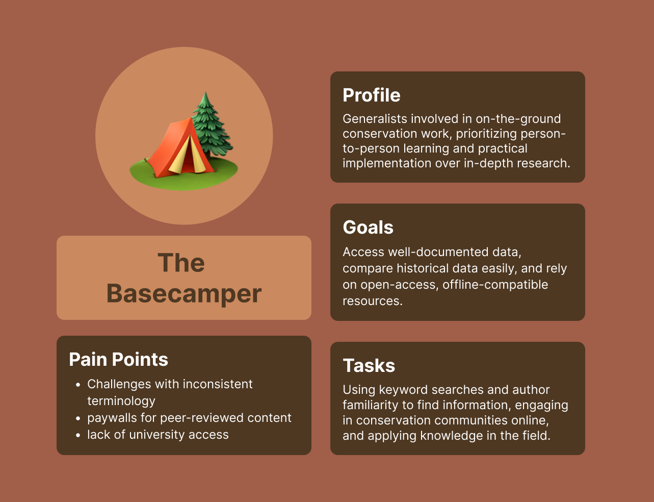
Key Insights
These archetypes highlight varying conservation roles, each with unique needs and challenges.
Designing tools for them requires balancing the Specialist’s precision, the Mobilizer’s coordination needs, and the Basecamper's practical focus.
Making sure we ask the right questions
To ensure our platform truly met the needs of conservation professionals, we had to take a step back and critically assess the core challenges they faced.
It wasn’t just about identifying surface-level frustrations—it was about understanding the deeper gaps in knowledge-sharing, collaboration, and accessibility.
How might we create a centralized, user-friendly platform that makes conservation research and resources easily accessible to professionals and learners?
How might we enhance searchability and navigation to help users quickly find relevant conservation information without feeling overwhelmed?
How might we foster an interactive and collaborative community where conservationists can share knowledge, discuss findings, and seek support?
How might we ensure the platform remains credible, up-to-date, and financially accessible to all users?
To create a trustworthy, accessible, and collaborative conservation platform, the system must include:
How are we doing it? Why a web application?
Core Features
✅ Community-Driven Discussions – Forums, comments, and team workspaces for open collaboration.
✅ Snapshot Articles – Quick, digestible summaries of key conservation topics.
✅ Credibility & Trust – Clear peer-review processes to validate information.
✅ Open Access – Freely available resources for all users.
Enhanced User Experience
✅ Save & Download – Users can store important articles for offline access.
✅ Smart Organization – Tags improve searchability and content discovery.
✅ Author Profiles – Credentials, contributions, and contact options for direct engagement.
✅ Regular Updates – Ensuring the latest, most relevant conservation insights.
A web platform emerged as the best solution to meet the global, interdisciplinary needs of conservation professionals. Accessibility and seamless collaboration were key factors in this decision.
By focusing on accessibility, organization, and collaboration, this web app empowers conservationists to share knowledge and drive global impact efficiently. There was no direct need to for a mobile solution, as of yet.
Key Advantages
🌎Global Access – Users can connect and collaborate from anywhere, without device restrictions.
🖇️ Centralized Hub – One searchable location for tools, discussions, and research
🫂 Real-Time Collaboration – Shared workspaces, discussions, and feedback drive engagement.
📖 Scalability & Open Access – Supports unrestricted knowledge-sharing with peer-reviewed credibility.
🔍 Enhanced Discovery – Search, tags, and author profiles streamline research.
3. Designing

Enhancing Discovery: Creating a Browse Page for Exploration
Having a ‘Browse’ page for the different articles included on the site was important so that users had the option of exploring topics that may be helpful to them rather than having to search for a specific keyword.

Workspace: A Personalized Library for Saved Resources
If users find a discussion topic or article particularly helpful they can save it to their ‘Workspace’. This page functions like a personal library where users can revisit saved articles and discussion threads.
Laying the Foundation: Establishing Site Hierarchy
We began our first design iteration by creating the site hierarchy which consisted of a main home page, ‘Browse’ page, ‘Discussions’ page, ‘Workspace’ page, and ‘Account’ page. The ideas and structure of these pages were fairly bare bones at this point, so, wanting to translate our ideas from our generative research, we began building rough wireframes.

Fostering Community: Building a Space for Meaningful Discussions
A ‘Discussions’ page is our main focus for building the community aspect of the platform. In this section, users can explore and contribute to conversations on broad and specific conservation topics through discussions or forum threads created by fellow users.

4. Testing
Usability Testing Insights & Actionable Improvements - Round 1 🚀
🔎 Improved Search & Filtering
Participants instinctively looked for filters & tags
Discoverability needs improvement for more efficient research
📌 Clearer Navigation & Terminology
Users found "Workspace" labels confusing
Terms like "discussions" vs. "forums" were used interchangeably
💬 Streamlining Discussions
Users were unsure if they were starting a new discussion or replying
📄 Optimized Content Previews
Some users preferred to skip search result previews and go straight to articles
🛠 Strengthening Trust & Content Integrity
The "Suggest a Change" feature raised concerns about unchecked edits
📝 Expanding Collaborative Features
Strong enthusiasm for on-site annotations for personal & team use
Resulting in majority of users completed tasks successfully, indicating improved usability.
We listened and we learned…
Design Iteration 2: Refinements & Enhancements 🎨
Building on insights from our first round of testing, this iteration focused on resolving usability issues, refining page layouts, and enhancing browse functionality. A key structural improvement was the tiered organization of Backgrounds, Approaches, and Tools (BATs)—a model validated by both our testing and client feedback. This approach acknowledges that research doesn't always follow a linear flow and enables more intuitive content discovery.
We also developed the site’s branding, logo, and color scheme, ensuring it stood out from typical conservation platforms while aligning with client preferences.

Additional improvements included:
✅ Standardize terminology & refine labels for better clarity
✅ Enhance search functionality & filtering options
✅ Adjust preview settings for faster access
✅ Highlight peer review process to reinforce credibility
✅ Develop annotation features to boost collaboration
Usability Testing Insights & Actionable Improvements - Round 2 🚀🚀
This round focused on testing refinements from the first iteration, engaging seven conservation professionals through five structured tasks.
🛠 Improved Workspace UI
Resized folders and redesigned icons for better visual clarity.
📌 Terminology Tweaks
Renaming labels like “What people are talking about” → “Trending Articles” and refining placeholder text
📢 Biggest New Feature: Annotation Function
Based on user enthusiasm, we introduced on-site annotations. Users can now:
✍️ Highlight & comment on articles for personal reference.
👥 Share annotations with colleagues in team folders.
💬 Publish insights directly to discussion threads, enhancing collaboration and knowledge-sharing.
5. Final UI


6. Learnings
1️⃣ Designing for Complexity & Scale
This project was more than just UI—it required strategic problem-solving, interdisciplinary collaboration, and knowledge-sharing optimization to create a truly impactful platform. I learned to balance structure with flexibility, ensuring professionals could navigate content in ways that worked best for them.
2️⃣ Building for a Global Audience
With conservationists worldwide, I had to design for diverse user behaviors, accessibility needs, and varying tech literacy levels—all while making the platform intuitive and inclusive. Organizing vast conservation data also reinforced the power of strong information architecture, proving that taxonomy, tagging, and hierarchy are just as crucial as visual design.
3️⃣ Thinking Beyond UX to Product Strategy
I focused on scalable, long-term solutions like community-driven content and modular design that evolve over time. More than just an interface, I helped create an ecosystem for research and collaboration, ensuring the platform would grow with its users.